
by Luca Passani
Practitioners Alternative to MWI BP (Best Practices) from W3C.
Motivation behind the GAP document and background information.
Table of Content
1.1 Prerequisites
1.2 What is XHTML MP 1.0?
1.3 Challenges of Mobile Development
1.4 Device Market Fragmentation
1.5 The Importance of Content Adaptation (AKA Multiserving).
1.6 the Role of WML as a Universal Mark-up for Mobile
1.7 the Role of HTML as a Universal Mark-up for Mobile
1.8 Other Mobile Technologies
1.9 Definition of Least Common Denominator (LCD)
1.10 Motivation for this Authoring Guide
1.11 Assumption on devices: the Baseline
2 Practices for XHTML MP
2.1 Best Practices = Adaptation
2.2 Groupings of Practices
2.3 Structure of Practice Statement
3 Practices
3.1 Development
3.2 Usability
3.3 Elevating the baseline
4 How to contribute to this document
5 Templates
6 References
Practice Quick Index
[MULTITEST] Test an application on at least 5 different microbrowsers
[MIME_TYPE] Use the
application/vnd.wap.xhtml+xml MIME Type[SIMPLE_CSS] Only use simple in-line CSS or none
[FEW_IMAGES] Keep the number of images in a page down
[ENCODING] Use UTF-8 encoding or better for non-english content
[BEWARE_OF_COLORED_LINKS] Do not try to color links
[AVOID_BACKGROUNDS] Avoid background pictures
[NO_VERTICAL_SPACE] Avoid Vertical Whitespace
[SPECIFIC] Place the most specific menu items in the top positions of menus
[ACCESS_KEYS] Use the 'accesskey' attribute to implementkeyboard accelerators on menus
[NAVIGATION] Provide consistently used links to navigate inside the application
[NO_TOP_BAR] Avoid navigation bars at the top of the page
[NO_REDUNDANCY] Avoid repeating links such as 'Help','About','FAQ' in every page
[NO_SPLASH_SCREEN] Avoid first pages made to be skipped
[ADD_TITLE] Provide a short but descriptive page title
[CONCISE] Use clear, short and concise terms and sentences
[DIFFERENT_MEDIA] Do not serve a website to a mobile device and do not serve a mobile site to a web browser
[USE_SHORT_URL] Adopt a short URL for site entry point(s)
[EXPLOIT_CACHE] Do not disable caching (unless low page lifetime is part of actual business model)
[INPUT_MASK] Use input masks to minimize user input
[BEWARE_OF_FORMS] Beware of HTML-style forms
[AVOID_LOGINS] Do not require that users login each time
[NO_PASSWORD_MASK] Do not mask user input when entering a password
[BEWARE_OF_COOKIES] Carefully evaluate how cookies are used in the application. Cookies may or may not work on some networks and/or some devices
[NO_BIG_PAGE] Delivered mark-up and images should not exceed 10 Kilobyte totally
[SMALL_PICTURES] Do not deliver pictures that are wider than the screen
[STATE_IMAGE_SIZE] Specify the real image width and image height in the mark-up
[MINIMIZE] Minimize the number of clicks required to carry out activities
[STILL_A_PHONE] Enable one-click calls for phone numers
[MAX_10_LINKS] Only exceed 10 links per page if the application demands it
[NO_WEB] Do not try to port all functions of a website to mobile
[NO_MWI_BP] Beware of W3C MWI Best Practices
[TESTING] Find real, non-techie users and make them perform functions. Observe what problems they have
[FIND_BASELINE] Try to identify own project's device baseline
[UPGRADE_EXPERIENCE] Review practices and fine-tune content accordingly
Global Authoring Practices
for the Mobile Web
- Public Draft:
- Version 1.0.4
- Official URL:
- http://www.passani.it/gap/
- Author & Editor:
- Luca Passani, luca dot passani at gmail dot com
- Last Update:
- April 2010
- Reviews and Contributions:
- James Pearce, Argogroup
Marten van Wezel
Martin Kindler, cityExperience.net
Cédric Bénazech, Atos Origin
Abstract
This document gives general guidelines for web developers and content authors who are searching for directions to help create sites for the mobile web.
While this document clearly appreciates that mobile web development poses extra challenges
to authors (as compared to the traditional WWW) and encourages developers
to explore techniques to deliver content in context-sensitive manners
(adaptation), the objective of the document is to explain how to get
the best user-experience out of a (potentially static) XHTML-MP 1.0 page.
This one-size-fits-all approach is sometimes referred to as Least Common Denominator (LCD).
While content adaptation is more likely to provide a better
user-experience than LCD, it is recognized that some developers/authors
may not be using adaptation for a variety of reasons.
This document is a guide about how to get the most out of single
non-dinamically generated XHTML MP pages and, at the same time,
it educates developers about common pitfalls in the design of mobile services.
It is assumed that the reader is familiar with HTML and the creation of web sites. Understanding of XHTML 1.0, XHTML Mobile Profile 1.0 and HTTP is a plus.
The terms mobile application, mobile document, mobile page and mobile service will be used interchangeably througout the document, since the practices provided by this document apply to both content authors and application developers.
Note to the Reader: Pressing the 't' key will make you snap back to the top from wherever you are in the document. Also 'b'= snap to bottom and 'p' = snap to Practices section.
1 Introduction
This document presents a set of practices to support the creation of acceptably usable mobile services based on XHTML-Mobile Profile 1.0.
The audience of the Global Authoring Practices are developers and content authors who are creating mobile sites for the first time
1.1 Prerequisites
The document assumes that the reader is, as a minimum, familiar
with HTML and the basics of web site creation.
Preferably, the reader should also be familiar with XHTML 1.0, which is
the normalization of HTML into an XML-based format by W3C.
1.2 What is XHTML MP 1.0?
XHTML Mobile Profile is the mark-up most widely supported
by browsers on mobile devices (microbrowsers).
Technically, XHTML MP is built on top of XHTML-basic,
a subset of XHTML 1.0 defined by W3C and originally
also intended for mobile devices, even though adoption of XHTML Basic
by device manufacturers has been limited.
XHTML Mobile Profile 1.0 (XHTML MP, defined by the OMA,
the Open Mobile Alliance) adds extra usability
and graphical features through the introduction
of WAP CSS (WCSS) and the 'style' tag and attribute.
Since XHTML basic is a subset of XHTML MP, the majority of
devices can also manage XHTML-basic content.
Evolution can be summarized as follows:
HTML 4 -> XHTML 1.0 -> XHTML Basic -> XHTML MP.The reference section at the end of the document provides links to XHTML MP tutorials ([XHTMLTUT]) and reference material [XHTMLREF].
A note about the Japanese Market: Japan represents a world of its own when it comes to the mobile internet. Not only has NTT DoCoMo endorsed cHTML (Compact HTML, a subset of HTML 4) as the mark-up for mobile in the i-Mode platform, but the level of consistency in cHTML support by Japanese devices is solid and consistent enough that Japanese developers are better served by referring to their own styleguides and reference materials when addressing the Japanese market. While those developers may find interest in reading this document, they will need to come up with their own understanding of how the practices can be applied to the their market.
1.3 Challenges of Mobile Development
Mobile devices have several limitations when compared to desktop PCs and laptops.
- Small screens
- Limited input capabilities
- Limited processor power and memory
- Limited bandwidth
In addition, there are also relevant differences in the value users assign to services depending on how critical that information is. Time and cost are factors that discourage users of a given web site from accessing its mobile counterpart:
- Web and mobile offer each a different value propositions to users.
These limitations have serious implications on the way one should design his/her mobile site.
1.3.1 Small screens
Navigating with a web browser is a more pleasant experience than doing the same with a mobile device. Mobile devices have small screens. Even today, the average mobile device allows for 20/25 character per line and 5/7 lines of visible text. In these conditions, simply scaling down a web site to fit a mobile device is bound to be catastrophic in terms of user experience.
1.3.2 Limited Input Capabilities
The majority of mobile devices are phones with a numeric keypad.
While this is sufficient for dialing phone numbers, entering text
with it is a time consuming, at times even annoying, activity,
when compared to a QWERTY PC keyboards.
This is a key aspect to remember when designing
interaction for applications.
1.3.3 Limited Processor Power
Aligning mobile devices with the capabilities of a PC
is a never-ending catch up activity for device manufacturers.
Microbrowsers are designed to scale down well on devices
that are primarily built to allow voice communication,
while keeping the form factor acceptable to consumers
that will constantly carry the device around with them.
This is an aspect to remember when trying to port
web functionalities that rely on CSS, Document Object Model
manipulation or scripting to a mobile device.
1.3.4 Limited and Expensive Bandwidth
Mobile devices have little bandwidth available when compared with PCs on the
Internet. With the advent of 3G (EDGE, UMTS, HSDPA) the situation has improved for
some users, but a lot of other users (or 3G users themselves when roaming
out of 3G coverage) can count on a speed down to just a few kilobytes per second
(GSM, GPRS). Latency introduced by the time needed to establish a connection
should also be accounted for.
While some operators offer flat-fees also for mobile navigation, others
still charge by connection time or volume. This aspect should be considered
and large graphics should be avoided.
1.3.5 Different Value Propositions for Users
Creating the mobile version of an existing website does not make sense in all cases. For example:
- Reading news, accessing email and looking at the price of stocks are typical examples of the kind of activities that users may want ot perform while they are mobile.
- Doing research related to their work is something even the most advanced users will prefer to delay until they sit by their PCs in the comfort of their homes or offices (and a broadband connection to the Internet).
- Booking a holiday is something that most people do not want to do
through a mobile application: too complicated and the risk of something
going wrong is either too high or perceived as such.
In spite of this, it may make sense for an internet-based travel agency to have a mobile site with last-minute offers in order to catch impulse buyers. In this case, the transaction should be finalized through a phone call to an operator. Not only is talking to an operator faster and less error prone, but connecting to the operator is typically just one click away, since mobile devices are primarily built to make voice calls.
Development of great user experience for mobile is to an extent
a "holistic philosophy", or even, an 'art', as much as it is a science that
can be codified in a set of rules.
While mobile devices are not as good as fixed browsers when it comes to
browsing, it is also possible to look at things the other way around.
Telephony, messaging and location-based applications
are examples of features that are unique to mobile.
Developers are encouraged to look at these extra possibilities that
are typically not part of the web paradigm
1.4 Device Market Fragmentation
Mobile development is difficult because different devices have different features.
This aspect is often referred to as 'Device Market Fragmentation' or 'Device Diversity'.
Differences among devices happens along multiple dimensions:
- Hardware characteristics
- Screen size, Keyboard (numeric vs QUERTY), Stylus,...
- Network characteristics
- Connection Speed, Bandwidth,...
- Multimedia Formats
- GIF, JPEG, PNG, WBMP, AMR, MIDI, MPEG3, MPEG4, 3GPP,...
- Browser behavior
- Openwave Browser ≠ Nokia Browser ≠ Opera Browser≠ .....
Formatting, speed, image layout,...
XHTML-MP and WCSS support varies greatly from browser to browser.
Device fragmentation is the consequence of several factors:
- Device manufacturers' drive to differentiate from competitors.
- Network operators' request to have devices that are unique or customized to their networks.
- Rapid innovation and advancement in underlying technologies and standards.
- Devices require an average 18 months from design to first device on the market.
- Device software is typically not upgraded. Poorly performing software stays around longer.
Because of this, issues related to device fragmentation cannot be expected to disappear any time soon.
1.5 The Importance of Content Adaptation (AKA Multiserving).
The widely varying characteristics of mobile devices effectively disrupt the development model used on the web, where:
- a relatively rich subset of HTML and CSS can be delivered to web browsers with acceptable results in terms of both design and usability.
- the dimension of the user's browser window either does not represent an issue or that issue can be addressed by dynamically re-flowing the content.
To achieve an acceptable user experience for mobile sites, authors need to deal with the facts that:
- There are relevant differences in terms of CSS and XHTML support in microbrowsers.
- Devices have screen dimensiones in the 90 to 320 pixel range for both width and height.
- All kind of minor disruptions can occur among devices.
Certain mobile applications can figure out (or, at least, hypothesise) device capabilities on the server-side. This allows the application to send customized content to the requesting device. These applications are 'adapting' the content and the process by which the content is transformed is called 'content adaptation' or 'Multiserving'.
There are many ways to do adaptation. Sending pictures that are the right size for the requesting device is the typical example, but there are other situation where adaptation is desirable. A few examples of adaptation follow:
- Redirecting devices to either the XHTML or the WML version of a mobile site, depending on which one is best for the requesting device.
- Adding/hiding links to downloadable content which is known to be supported/not supported by the requesting device.
- Sending the right MIME-type and character encoding to the requesting device.
Adaptation generally implies looking at HTTP headers used by a device for requests to the application to predict which features are supported by the device. In particular, no adaptation can be achieved with static XHTML-MP documents exclusively.
While some forms of adaptation are indeed simple, as a general rule,
adaptation adds extra cost and extra complexity to software projects.
While it is recommended that some form of adaptation is adopted by
mobile developers, extra costs are bound to be measured against potential
benefits.
Actual techniques for adaptation vary widely. Looking at the 'accept' HTTP
header is probably the simplest example, there is. Using a fully-fledged
framework, such as WURFL [WURFL] requires a deeper
understanding of the problems
and the tools. Drutt [Drutt],
MobileAware [MobileAware],
Volantis [Volantis] and others
also offer solutions in this space. W3C is also addressing
adaptation indirectly with an initiative called [DDWG].
DDWG aims at creating a standard API to access "Device Description
Repositories" from different sources.
An open source approach to adaptation that is both simple
and powerful is WALL [WALL], the Wireless Abstraction Library,
which lets developers code their pages with a mark-up similar to HTML, while
delivering WML, XHTML-MP and CHTML mark-up to the requesting devices
depending on device capabilities. WALL is a JSP Tag-Library. A port
to PHP also exists [WALL4PHP].
Note 1: Some use the term 'adaptation' when referring to the process in which an 'adapting proxy' on the network can re-arrange web content into smaller bits that a mobile device can access (albeit with different degrees of success usability-wise). Typically, adapting proxies are commercial products and network adaptation happens outside of the control of content authors. This kind of adaptation is out of the scope of this document.
Note 2: Some use the term 'adaptation' when referring to the ability of some browsers (notably Opera and Openwave) to columnify web pages when accessed through a mobile device. The process is essentially about:
- removing table layout
- placing elements with absolute positioning in the document flow
- resizing pictures.
The results of this "client-side" adaptation can give interesting results in some cases. Nevertheless, the amount of content that a device needs to download (average web page = ~130 Kb) and the amount of scrolling required of the end user typically compromises usability unacceptably. Client-side adaptation is aimed at web sites and covering it is out of the scope of this document [SmartRendering].
Note 3: Some mobile devices
with high resolution (320 pixel width or larger) feature
fully-fledged web browsers (such as Safari WebKit).
These browsers can visualize all pages and zoom in on parts
of the page that require more definition for correct
visualization.
Deciding if these browser should be considered web or
mobile browsers is up to both the developer and the consumer
(who may have conflicting views on the issue in some cases).
Assuming developers want to treat those browsers as
microbrowsers, they should be considered as baseline browsers
in case LCD is used, or they should be served a better version
of the content if adaptation is adopted.
Considering them web browser will place them out of the scope
of this document.
1.6 The Role of WML as a Universal Mark-up for Mobile
WML 1.1 [WML] is the mark-up language of the WAP 1.1
[WAP] standard introduced in the late
90s to enable internet on mobile devices. While WML has similiraties
with HTML-based markups, there are also relevant differences.
Similarities:
- WML has the concept of hyperlinks
- WML has the concept of forms, which can be posted through HTTP
Differences:
- WML is XML based.
- WML has its own MIME type (
text/vnd.wap.wml). - WML can represent multiple 'cards' (pages) within a single 'deck' (document).
- WML can program device softkeys (the buttons used to activate items in the native UI).
While WML has been the target of criticism for 'diverging' from established web standards (notably HTML), it has the merit of having made 'physically' clear that web and mobile are different media serving different requirements and different fields of application. Yet another advantage is WML widespread support on mobile devices around the globe: virtually every device produced anywhere over the past 6 years carries a WML microbrowser. While these practices apply to XHTML-MP devices (the mark-up language of WAP 2), it must be recognized that WML is currently the most widely supported mark-up. While this document chooses to identify XHTML-MP as the universal mark-up for mobile, it is recognized that WML may be a better alternative for services that require maximum global accessibility without adaptation and no particular requirement about color-rich graphics.
1.7 The Role of HTML as a Universal Mark-up for Mobile
While multiple versions of HTML [HTML] have been made available to developers over the years, today's predominant coding style on the web is still the one often referred to as "tag soup", i.e. HTML tags are used according to the visual effect they produce on one or more browsers, and not according to strict syntax rules and clear standard-based semantics.
Note:
Tag-soup HTML is typically served with text/html conten type.
In spite of the fact that usage of tag-soup HTML
is frowned upon by those who advocate XML-based XHTML 1.0,
it has been argued that much of the success of i-Mode in Japan
is due to the choice of "Compact-HTML" (a subset of HTML) as the
mobile mark-up: by being lenient with mark-up errors, CHTML
has effectively enabled thousands of Japanese users to
publish mobile content. Some argue that resilience to HTML errors in
web browsers (often referred to as 'quirks mode' HTML parsing)
has fueled the exponential growth of web content.
Because of its widespread adoption on the web,
most mobile microbrowsers can render 'tag soup'
HTML with varying degrees of success.
Such generalized support for HTML-based mark-ups
has effectively turned HTML into a candidate language for mobile.
Resorting to HTML for mobile development
has positive and negative implications for developers.
On the negative side, by adopting HTML, the number of supported
devices would be reduced. In addition, some microbrowsers apply heuristics
to adapt web content to mobile when the
HTML content type (text/html) is encounterd.
This can affect the rendering of a page in unexpected ways.
Typically, CSS may be ignored and table layout may be disrupted
and 'columnified'.
Apple's iPhone will assume that a page served as HTML
is a page meant for the full web, and will use tiny fonts also for
mobile content, thus forcing users to zoom in and scroll in order to
make text readable and be able to select links.
This will severely diminish the usability
of the site for iPhone users.
Finally, HTML would make errors in mark-up go by undetected,
yet those errors would negatively impact the page rendering speed,
thus reducing the perceived responsiveness of the system
and degrading usability.
On the positive side, by adopting HTML, 'newbies' would not
have to deal with the intricacies of XML-based mark-ups, such as:
the need to validate content, adding relatively obscure XML
prolog/doctypes to each page, manage the configuration of
unfamiliar MIME types and so on.
A significant extra advantage with HTML would be the ability to
preview mobile content with all web browsers, including MS Internet Explorer,
which notoriously cannot handle the XHTML Mime type properly
[XHTMLMIME].
While this document elects XHTML-MP as the mark-up of choice for mobile,
it is acknowledged that HTML may represent a viable alternative
for hobbists and semi-professional mobile authors.
Nevertheless, this document discourages developers from
adopting HTML as a mobile mark-up, since the extra effort
required by using XHTML MP is limited when compared to the
advantages in terms of rendering speed and number of
devices supported.
It should be noted that the majority of practices in this document will
also apply when HTML is adopted and HTML authors will benefit from
reading this document as well.
1.8 Other Mobile Technologies
For completeness, the role of other mobile technologies in the context
of this document is briefly discussed.
There are at least three or four major mobile technologies
on the market today which allow the creation of
usable and graphically pleasant mobile applications. Among these technologies
the following are mentioned: Sun's J2ME [J2ME],
Macromedia/Adobe's Flash lite [FLASH LITE]
and Qualcomm's BREW/uiOne [BREW].
While it is acknowledged that these technologies can be leveraged for
the creation of usable and graphically appealing mobile apps, none
of them has been adopted as universally as XHTML-MP and WML. For this
reason, they fall outside of the scope of this document.
In spite of the different focus, developers and authors
who adopts those technologies may find useful information
in this document as far as usability goes.
1.9 Definition of Least Common Denominator (LCD)
Least Common Denominator (LCD) is the coding style that authors need to resort to when adaptation is not a possibility for any reason. In those cases, any HTTP client which requests the document will receive the same HTTP headers, the same mark-up and the same pictures in terms of size and format.
While LCD is the most widely adopted approach for the creation of internet web sites, device fragmentation prevents LCD from being equally effective on the mobile web. Choosing a default experience that does not take device features into consideration is bound to deliver a poor user experience on most devices.
1.10 Motivation for this Authoring Guide
This document clearly makes a point that authors/developers should turn to adaptation for the creation of usable mobile sites. Nevertheless, it is acknowledged that many developers/authors will attempt to create LCD sites anyway. The objectives of this document are:
- To help developers maximize the user-experience delivered through LCD on the widest possible variety of devices
- To educate developers about pitfalls of mobile development and how adaptation can make their mobile sites more succesful.
Among the reasons why authors/developers may choose not to apply adaptation in some form are:
- Extra cost and complexity introduced by adaptation.
- Lack of free hosting services that allow adaptation (free hosting service typically only allow static pages).
- Lack of understanding of HTTP.
- Lack of previous experience with mobile development.
- Failure to understand the importance of usability.
This document is addressed to those who choose LCD in spite
of having been warned that adaptation is key to delivering
a usable service on a wide array of devices.
Putting things in different terms:
The goal of this document therefore is to both show and explain the LCD, as well as point to resources that describe the preferred, but more advanced course of action.
1.11 Assumption on devices: the Baseline
The definition of the practices must necessarily rely on a set of assumptions about the capabilities of the target devices. The range of mobile devices available worldwide is so varied, that hardly any recommendation can be provided before the range is clearly identified.
Having excluded WML-only (WAP 1.X) devices from
the set of target devices, a considerable simplification
of the problem has been achieved.
Unfortunately, there are some XHTML-MP mobile devices that
feature particularly poor implementations of the standard,
this applies particularly to the first WAP 2 devices which reached
the market in 2001-2002.
Because of this, a choice is made to restrict the applicability
of the practices to devices that meet a certain standard which
will be referred to as 'the baseline'.
Devices which meet baseline requirements or above will support the following features:
- XHTML MP 1.0
- Support for XHTML Mobile Profile 1.0.
- GIF and JPEG
- Support for GIF and JPEG image formats.
- 256 colors
- Color device with support for a minimum of 256 colors.
- 120x120 screen
- 120x120 pixel screen or larger.
- At least 10 Kilobyte of content
- Device can manage at least 10Kb of combined mark-up, graphics and CSS content.
- Basic support for Tables
- two columns tables are supported. no 'rowspan' and 'colspan' support required.
- Picture and Link on the same Line
- Device can display a picture and a link on the same line.
- 9.6 Kbps Minimal Bandwidth
- Device and network support at least 9.6 Kbps bandwith.
It would be possible to require extra properties on the baseline device, but this would restrict the amount of devices LCD can be applied to. In other words, in order to build an LCD style-guide, some choice has to be taken regard which devices to address. Strict requirements will make LCD more powerful, while diminishing the range of devices LCD can be applied to. Loose requirements will allow LCD to address a larger set of devices, at the expense of authoring expressiveness.
The choice made by this document is an arbitrary compromise between these two opposite requeriments, which should keep 90% (or more) of devices currently accessing the mobile web in range for LCD.
Note 1: The baseline choice is arbitrary, yet it is based on the experience of professional in the mobile business. It is not excluded that upgrading the baseline to represent better devices, while remaining in the 90% range, could happen in the future. In that case, the practices would need to be re-visited accordingly.
Note 2: It is not excluded that,
in some situations, the device set is limited by the nature
of a given project (operator limited device portfolio, vertical
application). In those cases, the LCD
approach may make more sense
than in the general case, but developers/authors should also identify
a different, more powerful baseline. While many practices in this
document will still apply also in those cases, others should
be filtered by the awareness that the baseline is different.
The practices that could be revisited in case of a better baseline will
be marked with a note. This document also dedicates a paragraph to
elevating the baseline.
Note 3:The baseline configuration for devices is similar in concept (but not identical) to what W3C' Best Practices refer to as "Default Delivery Context".[DDC]
1.11.1 Devices that score below the baseline
This document does not issue any particular recommendation
about how to handle HTTP requests from devices that fall outside
of the set identified by the baseline.
Under the assumption that adaptation is not an option, the default
trajectory for such devices is either to result in an error
(WML devices) or an unsatisfactory user-experience (poor XHTML-MP support
in microbrowsers).
As mentioned, this is expected to happen only for less than 10% of the
devices which try to access the service.
2 Practices for XHTML MP
What follows is the list of practices for mobile authoring.
2.1 Best Practices = Adaptation
It should be noted that a decision was taken not to use the term "Best Practices" in this document for two reasons: to avoid confusion with W3C' Best Practices [BP] and because it is believed that content adaptation is the best way to achieve acceptable user experience. For this reason, the term Best Practices is considered a reserved word for the time when a set of practices for multiserving will be created.
2.2 Groupings of Practices
The practices will be split into two groups: development and usability:
- Development relates to practices of technical nature mostly related to the XHTML-MP mark-up.
- Usability relates to user-perception of the application and are mostly agnostic of the mark-up adopted.
2.3 Structure of Practice Statement
Each practice statement will be composed of three parts.
The Statement:
The Rationale behind the statement:
Etymology: Latin, neuter of rationalis
- an explanation of controlling principles of opinion, belief, practice, or phenomena
- an underlying reason :
Suggestions to implement the practice (Optional):
Suggestions will be displayed in plain text.
3 Practices
Mobile developers who cannot or do not intend to adopt adaptation techniques, are encouraged to apply these practices in their mobile applications.
Practices are split in two groups: those related to development and those related to usability aspects of the application.
3.1 Development
Validation of XHTML MP
In spite of this, there are still devices out there that will break on not strictly well-formed XHTML MP or not valid XHTML-MP.
For this reason, it is recommended that applications' pages are tested with a validator.
Practice: The W3C's Validator is a good starting point [VALIDATOR] for validating the mark-up generated by an application.
XMLLint [XMLLINT] is a useful utility to check
a page XML validity through a command-line tool.
Most microbrowsers are tolerant to minor validation and well-formedness errors, but this
will not guarantee that an application would not appear broken when accessed with a different
microbrowser.
Note: This practice may be revisited in
case authors need to comply to strict requirements for
the visual appearence of their pages or in
case the baseline is elevated.
HTML tags and attributes (for example, cellpadding and cellspacing
for XHTML tables) can deliver graphically accurate renderings in ways that
are not achievable through CSS (through the padding and
spacing properties, for example),
mainly because of poor CSS support in minibrowsers.
This behavior can be observed also in minibrowsers running on high-end devices.
While the usage of extra XHTML attributes will make an XHTML-MP page
non-valid, opting for non-valid, but effective, mark-up may be
preferrable in some cases.
Making sure that a page is well-formed is still recommended, since
well-formed XHTML-MP mark-up is less likely to cause troubles
than invalid XHTML-MP.
Testing Applications
Practice:
Acquire at least 5 devices for development and testing, where each device
has one of the following browsers: Nokia WAP Browser series 40,
Openwave Mobile Browser version 6 or greater, SonyEricsson (Teleca), Netfront,
Opera for Symbian.
The list above is minimalist in nature. More robust testing could include
one or more of the following microbrowsers:
Motorola Mobile Browser 2 or grater, Microsoft Mobile Explorer,
Nokia Series 60, Safari for Nokia. In addition, there are devices such as the BlackBerrys or
Palm OS-based devices which have browsers of their own.
It should be noted that browsers from the same manufacturers may have different
features from version to version. Those browsers/devices are covered by this
document as long as they satisfy the requirements of the
baseline device.
This document does not recommend any particular device for testing,
since devices vary from place to place (i.e. GSM vs CDMA vs iDen...)
and from month to month (new devices shipping at all times).
If in doubt about which devices run the browsers mentioned above,
turning to popular mobile developer forums
(such as WMLProgramming at Yahoo Groups [WMLProgramming])
for advice is a viable option to find expert recommendations for specific cases.
Note: This practice may be revisited in
case the baseline is elevated.
In addition, this practice does not necessarily apply to the Japanese market,
in spite of the fact that testing is a good practice for Japanse applications too.
MIME type
application/vnd.wap.xhtml+xml MIME Typeapplication/vnd.wap.xhtml+xml is the best choice.One of the disadvantages of this MIME type is that it prevents developers from previewing the applications in some regular web browsers (notably Microsoft Internet Explorer up to version 7). On the other hand, the
text/html MIME type fools some
devices into believing that it is a regular page they need to render. This may get them to
apply heuristics that conflict with the intentions of the author.Yet another possible MIME type is the XHTML-basic one (
application/xhtml+xml),
which does not completely solve the web preview issue, while not behaving like its OMA
counterpart in all cases.Some basic hosting solutions may disallow authors from adding the OMA WAP Mime type. In that case, the default association between the
.xhtml file extension and
the application/xhtml+xml content type is
a better choice than text/html for reasons explained
previously.
Practice:
If adaptation is not possible, the web server should be configured to serve
mobile content with the application/vnd.wap.xhtml+xml content type.
For static files, this is typically achieved by associating the
.xhtml file extension with the application/vnd.wap.xhtml+xml
in the web server 'content mapping' table.
If the application is responsible for sending the right MIME type, then
application/vnd.wap.xhtml+xml should be used.
It should be observed that being in the position to generate dinamic content
with technologies such as PHP, ASP, Perl and Java, typically implies the
possibility to look at HTTP headers and do some conditional programming.
In this case, there is a very simple trick to multi-serve the MIME type
to microbrowsers. The trick implies looking at the accept header string
to understand what MIME types are supported ([MIMETRICK]).
This trick also enables Internet Explorer to preview a mobile application,
by serving the mark-up to that browser with the text/html MIME type.
The above trick may not be optimal for recent BlackBerry devices. Those devices
will claim to support all the HTML-related MIME-types in the accept: header,
thus inducing a application/vnd.wap.xhtml+xml type. Unfortunately, this MIME type
(as well as application/xhtml+xml) will cause the BlackBerry to ignore tables
and CSS, which would otherwise be rendered normally with text/html. It should
also be observed that RIM devices often depend on extra proprietary proxies
deployed at operators. This means that the same devices may have different
capabilities with different operators. For example, BlackBerrys from legacy
Nextel (USA) are WML-only.
Little or No CSS
Many devices will not honor the color CSS assigns to links, for example. Another problem is that devices will take more time to render a page if rendering the page requires that an external CSS is loaded and parsed.
To add to that, it is not unusual that buggy (but nevertheless popular) devices simply do not cache CSS retrieved in previous requests, which ends up slowing the rendering for every page.
Practice: Keep styling information to a minimum and do not
change the color of links. Using WCSS for input masks
[INPUT_MASK] is a good idea
because it will degrade gracefully on all known browsers.
Advanced CSS constructs such as media queries
[MEDIAQUERIES] should be avoided:
Only a few browsers support Media Queries acceptably (notably, recent
versions of the Opera browser). In addition, pages based on
Media Query hardly degrade gracefully on non-supporting devices.
Microbrowsers typically end up downloading large graphics,
which, in the author's intentions, was not meant to be
delivered to a mobile device.
Good WCSS tutorials are available on the internet
[WCSSTUT]. It should be observed that, while
those tutorials typically advise to place CSS sheets
in an external document, this document recommends to keep
CSS in-line for LCD pages out of usability
concerns.
Note: This practice may not apply in case the baseline is restricted to higher-end devices with more solid CSS support.
Minimizing the number of pictures
Many devices will not enable softkeys nor return control to the user until the page is fully loaded and rendered. This will make it impossible for users to invoke browser functions (notably, backward navigation) for a frustratingly long time.
Practice: Testing a page on SDKs (i.e. over a PC with high bandwidth) may hide the real user experience. It is advisable that tests on real devices are performed as early as possible in the development cycle in order to obtain an accurate perception of actual user experience.
Providing the right encoding for content.
In case adaptation is not an option, adding the UTF-8 encoding string to the XML prolog has the best chance of fixing the problem for western languages.
If adaptation is an option, serving different encoding to different devices will help addressing issues with devices that only support iso-8859-1, utf-16 or other encoding.
Practice: The encoding can be specified this way:
<?xml version="1.0" encoding="UTF-8"?>
If adaptation is an option, looking at the "accept-charset" may work in identifying supported charsets on some devices. For example (SonyEricsson W810i):
accept-charset = utf-8, utf-16, iso-8859-1, iso-10646-ucs-2,
                 Shift_JIS, Big5,*
Beware of Colors
In addition to this, the same color may vary greatly from device to device. The same RGB color can appear like a light green on a device, and turn into a dark background that makes everything unreadable on another device. This can also apply to two instances of the same microbrowser on different devices.
Practice: Setting the background to blue and using CSS
to color links white will result in unreadable black labels
against a blue background on a wide range of devices.
If adaptation is not an option, avoiding
background images and colored links is the safest choice to
make sure that content is usable across a wide array of devices.
If no color info and no background are specified, devices will resort
to default colors, which are typically very readable.
Background colors may be OK only as long as authors stick to
light hints of color.
Developers who adopt LCD should also avoid styling 'visited' and
'active' hyperlinks as follows:
a {color:#0000FF;}
a:hover {color:#0000FF;}
a:link {color:#0000FF;}
a:visited {color:#0000FF;}
a:active {color:#0000FF;}
Some devices may highlight selected links by inverting link color and background color, effectively hiding the label of the currently selected link in case the above CSS is applied.
Note: This practice may be revisited in case the baseline is elevated and in case of adaptation.
Avoid too much vertical white space
Practice: Avoid adding vertical white space in a page.
Code like the following is not unusual on poorly designed mobile sites:
<br/>
--<br/>
<br/>
While this code may have a nice visual appeal on some devices, it will
cause the problem described above. Using the XHTML-MP <hr/>
is a better option.
Note:One word of caution about <hr/>:
it may break the validity of an XHTML-MP page in subtle ways
and make the application break almost inexplicably on some
specific devices (Notably some versions of the Teleca browser running
on SonyEricsson devices).
3.2 Usability
Order of Menus (most important choices first)
Practice: This is a question of how items are placed in a manu relatively to one another. If one of the menu items is labelled 'Information' and another one is labelled 'Weather', the latter should be presented before the former, or users looking for weather information will descend into the information section without realizing that 'Weather' was one of the available choices.
Note: One open question is who defines the importance of each item in the first place. This choice may be about letting users choose through usability tests ([TESTING]).
Access Keys
In menus, access keys allow experienced users of the service to reach the information they need faster by memorizing the numeric combination that will take them where they wish.
For example, 3-2-6 might be the path to today's horoscope.
Practice: The following XHTML-MP construct will deliver a numbered menu
on all baseline devices or superior. Numbers are guaranteed to be displayed only
once and items will be selectable by 'pressing' the accompanying number.
'Pressing' may mean simply pressing or 'pressing and holding' (Nokia devices).
<?xml version="1.0" encoding="UTF-8"?>
<!DOCTYPE html PUBLIC "-//WAPFORUM//DTD XHTML Mobile 1.0//EN"
        "http://www.wapforum.org/DTD/xhtml-mobile10.dtd">
<html xmlns="http://www.w3.org/1999/xhtml" xml:lang="en">
<head>
    <title>Contacts - R</title>
</head>
<body>
<p>
Pick contact:
<ol>
  <li><a href="contact.jsp?id=32" accesskey="1">Ramona</a></li>
  <li><a href="contact.jsp?id=45" accesskey="2">Robert</a></li>
  <li><a href="contact.jsp?id=21" accesskey="3">Romeo</a></li>
  <li><a href="contact.jsp?id=17" accesskey="4">Ronan</a></li>
</ol>
</p>
</body>
</html>
Caveat for the Japanese market: This code may not be the most suitable for the Japanese market and I-Mode devices.
Navigation Mechanism: Home/back link at the end
Such navigation links should be placed at the end of the page to avoid cluttering the interface and forcing users to scroll past the same links at every page.
Practice: Add navigation links at the end of each page.
At a minimum, a link labelled 'Home' (or the equivalent in the user's language)
should be present.
There can be exceptions to this rule in case of confirmation
requests ("Really Delete? yes|no") or other situation in which
the user shouldn't be distracted from the task he or she is performing.
No Navigation bars at the top
As suggested by the [Navigation] practice above, make sure navigation links are are available at the end of the page.
Practice: Do not add a navigation bar at the top of application pages.
Note 1: This practice may not apply in case the baseline is
elevated to
higher-end devices. In those cases, large screens, the possibility to
have smaller fonts for navigation links and the availability of
a four-ways rocker (clicking past the navigation bar just requires
one extra click) can make the presence of a navigation bar acceptable.
If adaptation is available, navigation bars may optionally be
inserted at the top for high-end devices.
In these cases, it may also make sense to place 'bread-crumb' navigation
(for ex: Home >Hardware >Chainsaws)
or page numbers ( page 3 of 10 ) to navigate through
large amounts of text, similarly to what is seen on web pages.
Note 2: This practice should not be confused with the case where a navigation bar supports a page function. A user may be looping through large amounts of text or a list of previews of downloadable content. In those case, backward/forward navigation as well as knowing how many extra pages are there before the end, would not be cluttering the UI, rather they would represent the UI itself.
Avoid unnecessary links
Practice: Most users do not access on-line help even when available on desktop applications. Virtually all mobile users will stay away from a link that labelled 'Help' or 'About'. Success can be achieved by making the application intuitive to use. Not cluttering the page with unnecessary links is a step in the right direction.
Avoid splash screens
Practice: Avoid so-called 'splash-screens'. Make sure that the first page the user receives has links to activate the main functionalities of the site.
Add a meaningful page title
Practice: Some devices will truncate title strings longer than 8-10 characters. For this reason, it is probably a good idea to keep the title short.
Concise and Clear Language
This factor and the tiny size of the screen of a mobile device imply that carefully worded sentences and labels have a greater chance to be understood by the intended audience and make the overall application more pleasant to use.
Practice: The number of words should be reduced in every possible way. Using the label "Age:" is a better choice than "Please enter your age here:". Another example could be to avoid words like "Entertainment" when one can simply say "Fun".
Different media means different user experience
Practice: if adaptation is not possible, two different
URLs should be provided: one for the website and one for the mobile
site. While
Lately, a new Top-Level domain called '.mobi' (pron.,dot-mobi)
([DOTMOBI])
has been created specifically for mobile. In case a .mobi domain
is acquired, the mobile site URL would be "organization-name.mobi".
If adaptation is possible, a popular approach is to advertise one URL
The advantage of this approach is that a unique entry point
to both applications is maintained.
Techniques and heuristics to recognize and redirect
browsers are available on the internet either as
standalone [DIFFER]
or as part of a framework such as WURFL [WURFL].
Adopting short URLs
Practice:Sites such as Tinyurl.com allow everyone to define short
URL as a free service. Commercial organization may pay for an equally short,
but more memorable, URL.
Cache Management
Caching strategy vary for different devices. Trying to fine tune caching strategies quickly leads into adaptation, which may not be an option for the audience of this document. In spite of this, avoiding to specify any caching directive for the page will typically lead to pages that are not reloaded when users press the back button of the browser. This is a great starting point.
Practice: Disabling the cache can mean many different things. In most cases,
users expect to find new content when they access a certain page again, yet,
they expect to find the same content when they press the back button to return
to a previous state where they feel comfortable.
The exact caching model is part of the business model of the application. Browsing an
email inbox may require nothing short than total disabling of any caching.
Weather forecast may live with a couple of hours caching.
Yet again, advertisement and banners may pose additional requirements
on caching. These requirements may clash with the service usability.
Things are complicated by the fact that some microbrowsers allow fine grained
control of the cache by respecting Time-To-Live (TTL) directives, while others
only respond to a somewhat brutal use of META tags.
Assuming that adaptation is not an option, two techniques are provided:
completing disabling the cache and a somewhat softer reset that will preserve
the usability of backward navigation (back button).
Disabling caching completely
Different microbrowsers (and microbrowser/gateway combinations) react in
different ways to different META-tags and HTTP headers.
The following set of headers has been proven to work on a wide
range of devices to disable caching for the page:
Expires: Mon, 26 Jul 1997 05:00:00 GMT
Last-Modified: DD. month YYYY HH:MM:SS GMT
Cache-Control: no-cache, must-revalidate
Pragma: no-cache
The Wireless FAQ [WIRELESSFAQ] illustrates
how headers can be set in different programming paradigms.
In case access to headers is not possible, the same functions
can be achieved with the usage of the following META tags:
<meta http-equiv="expires" content="Wed, 26 Feb 1997 08:21:57 GMT">
<meta forua="true" http-equiv="Cache-Control" content="must-revalidate"/>
<meta http-equiv="Pragma" content="no-cache, must-revalidate">
Soft cache disable
This is the illustration of how page cache can be disabled without
interfering with the back-button functionality, which should
always bring the user back to the previously visited page.
No HTTP header or META tag should be used to disable caching. All the
links to an application page should be different. This can be
achieved by adding dynamically a bogus HTTP GET parameter to
each internal link. The time in seconds is a good candidate for this.
The following JSP/JSTL example shows how a link to a newly modified bookmark
page could be created to make the microbrowser perceive it
as a different URL. This fools the browser into reloading
the page from the service and not from the cache:
<jsp:useBean id="now" class="java.util.Date" scope="request"/>
<a href="bookmarks?id=${bookmark_folder_id}&
cache_buster=${now.time}">Go to Bookmarks</a>
It goes without saying that this trick cannot be performed with static XHTML-MP pages.
Manage User Input (use input masks/minimize clicks)
Input Masks
Most mobile devices let users specify input-masks, i.e. the format with which user-input is supposed to be entered. If a telephone number is required of the user, setting the input form in numeric mode greatly simplifies the task of entering the data for the user. Also, this prevents user errors.
Beware of Forms
XHTML-MP forms are very similar to the ones in HTML, which, in turn, mimic widgets such as push button, radio buttons, check buttons, combo boxes (also called 'drop-down' boxes) and others commonly found in desktop applications.
While those widgets are usable in web pages and desktop applications, they are often implemented in ways that force users to do far too many clicks on a mobile device. Selecting, activating and deselecting each single widget is time consuming and not pleasant, particularly on devices without a stylus or other pointing device (the great majority of devices).
Developers should get creative about ways to minimize recourse to such widgets. While complex forms with text fields, radio buttons and drop-down boxes are the norm on the web, they should be avoided on a mobile devices by splitting a form in several atomic steps (such forms are sometimes referred to as 'wizards'). Wizards make users focus on a task at the time and are less error-prone than monolithic (elective) forms.
Avoid Logins
Logins are a big killer for usability. Requiring users to type a username and a password before they can use the application will reduce the number of users by two-thirds or more.
If the application business model does not allow for the removal of a login task altogether, developers should at least make whatever they can to recognize users the second time they access the service and refrain from requiring login.
Do not use password masks
Reading what is on the screen of a mobile device is often hard enough for the user of the device. Peeking over the shoulder of the user is less likely to disclose a password than observing the user's keypress sequence.
For this reason, hiding user input to users themselves by replacing each character with a '*' (star) symbol (or similar) will do very little to protect privacy, while making it generally harder to use the service. For this reason, users should be made enter passwords in clear text.
This practice does not detract from the aforementioned practice to avoid login and find alternative ways to identify users.
Caveat: In case of highly sensitive application (such as 'Net Banking'), security requirements may force you to overlook this practice. For example, some users may perceive the lack of password obfuscation as a sign of slack security practices.
Practice:
Input Masks: XHTML-MP lets developers add input masks
with the following syntax:
<input type="text" name="pin" value="" style="-wap-input-format:NNNN" />
Some early versions of XHTML-MP microbrowsers did not understand the above syntax and were better served with the following syntax:
<input type="text" name="pin" value="" format="NNNN" />
If adaptation is possible, multiserving the input-mask would be
a good idea.
If not, choosing the syntax in the first example is preferable.
Not only is it more elegant, but the CSS syntax will not make
the application break on browsers that do not support it.
The XHTML references in the reference section
[XHTMLREF] contains the
specification of formats.
It should be noted that this is an area in which different
microbrowsers behave differently and adopting
adaptation is strongly encouraged.
For example, input masks such as "NNN-NNN-NNNN" to
identify a US phone number may be supported usably
on some devices and not in others. If adaptation
is not an option, relying on a simpler numeric
input mask would be a better choice for this case.
Forms: Radio buttons, checkboxes and combo boxes tend to
be confusing and require too many clicks. It is usually
possible to re-define complex forms in terms of set of menus.
For example, the following code shows a combo box
implemented though a syntactically correct XHTML-MP code snippet.
The combo box is rendered as shown on the left. This is not
very usable, since users are required to perform the following activities:
- Scroll to the combo box and select it (which brings them to a virtual page that implements the choices. This makes the user loose context)
- Select the right value
- Choose to abandon the combo box (which brings them back to the original context)
- Focus on what the next thing to do is (de-select the combo and select the next widget in the form).
Forcing the user to perform a large number of clicks and to concentrate continuously on what he or she is doing is likely to make the application feel unfriendly and hard to use.
Age: <select> <option value="17">Less than 18</option> <option value="25">[19-25]</option> <option value="45">[26-44]</option> <option value="100">over 44...</option> </select> |
-> |
To optimize the number of clicks, a better option is to break down the form in more atomic parts which require users to focus on a single task at the time. The case described above could be implemented in terms of single steps. In particular, the age could be collected by providing a set of links. When to user selects a link, the age is chosen and the user is automatically brought to the next step of the form.
<title>Age</title> : <a href="next/form?age=17">Less than 18</a><br> <a href="next/form?age=25">[19-25]</a><br> <a href="next/form?age=44">[26-44]</a><br> <a href="next/form?age=100">Over 44</a><br> |
-> |
For example, text input fields often require clicks to
activate and deactivate. Combo boxes bring users to a new virtual
page and back after the selection, which may be confusing
to some users.
Creating usable forms is generally difficult. Developers
are encouraged to do usability tests with real users
([TESTING]) as early as possible
in the lifecycle of the application,
possibly with the help of prototypes.
It cannot be ruled out that different forms are
required to optimize usability on different classes of
devices. This is consistent with the general idea
that adaptation drammatically improves the success of
mobile applications.
Avoid Logins: Assuming that removing login tasks completely
is not an option because of a mobile site business model, there are
a few techniques to prevent users from having to login again the
second time around.
Most operators gateway attach extra HTTP headers to each mobile-generated
request which uniquely identify the user. This bit of information
can be used to recognize the user and log him or her in automatically.
Yet another option is to use cookies. While cookies may
not be supported on some ntwork or on older devices, they should be used to
avoid the login task when available.
Some WAP gateways can manage cookies on behalf of a device which
does not support them.
Do not use password masks: this practice can be easily
applied in XHTML-MP (and other HTML-derived mark-ups) by using:
<input type="text" ..../>
in place of:
<input type="password" ..../>
to implement a password entry field.
Note: These practices should be candidates to revision in case the baseline is elevated. This is particularly true of the case when a stylus or other pointing device is part of the new baseline.
Cookies may not be reliable
Access to the mobile Internet is often achieved through WAP gateways (HTTP proxies managed by mobile operators). Most gateways manage cookies on behalf of devices that have no cookie support. This further increases the number of devices for which basic cookie support can be assumed.
Finally, caution should be taken when "cookie support" is assumed. Many devices/gateways may not be supporting the full RFC 2109 specification, i.e. limitations on the size and/or lifetime of cookies as compared to what is available for vanilla web programming must be accounted for.
Generally speaking, cookies are available in some form in excess of 80% of the cases. It is advisable to rely on cookies to provide improved user experience (for ex., to avoid logins). On the other hand, relying on cookies for fundamental parts of the service (such as session management) may cause the application to fail for some users.
Practice: If an application only relies on cookies for improved service,
but is not essential to the well-functioning of the service itself, then cookie
support can be safely assumed.
If cookies availability is essential to the correct functioning
of the application (typically for supporting user sessions), then alternative
mechanisms should be assumed. URL-Rewriting is the common way to by-pass the
lack of cookie support ([URLREWRITING]).
One word of caution should be spent about usage of URL re-writing
for mobile applications. Many commonly available URL-rewriting packages assume that
the HTTP client is a web browser. For this reason the rewritten URLs include session IDs
that can be very long and contain special characters. This can cause problem
on some mobile devices.
Some URL rewriting libraries let themselves be configured
to address this problem by avoiding special chars and keeping session IDs
under 50 chars. Creating one's own URL rewriting function is also a possibility.
Finally, in many cases, operator gateways and independent portals attach
unique headers and values to each HTTP request, such as phone number headers
(x-wap-msisdn, x-nokia-msisdn, x-up-calling-line-id) and
subscribeer id headers (x-up-subno). The headers
can be exploited as unique keys to track users and the foundation
for session management.
Some detailed techniques to track users are presented here
[TRACKUSERS]
Note: This practice should be amended in
case the baseline is elevated.
For example, the application could be developed for an operator that
supports cookies fully for all of its devices. Another possibility
is that the baseline is restricted to devices with full cookie support.
Large content
If multiserving is not an option, 10kb represents a good compromise.
Practice:
Each mobile page should not contain more than 10 Kilobytes of content
totally (i.e. XHTML+Pictures+CSS).
In case adaptation is used, it is OK to serve larger pages to the devices
which can handle them.
It is observed that device memory, screen size and download speed
should not be the only limiting factors when deciding how much content
to deliver to a device. The form factor of a mobile device will
make it hard for the user to scroll precisely through large
amounts of text and images, even when a large screen
and a stylus are available.
For this reason, it is recommended that mobile pages do not exceed
40kb totally even for high-end devices.
Note: These practices should be candidates to revision in
case the baseline is elevated.
This is particularly true in case of devices with large screens,
fast rendering of pages and high-bandwidth connections.
Keep images small
Practice: Adaptation is strongly encouraged in cases like this.
Developers should find frameworks to serve pictures in different sizes to different
classes of devices in order to avoid scrollbars and low-quality resizing.
If adaptation is not feasible, pictures should be constrained by the screen size
of the baseline device (120x120 pixels).
Note 1: Some image editors (even popular ones)
are adding extra information in JPEG
pictures through 'tagging' and/or a standard called EXIF. This may
increas the size of pictures (and, correspondingly, download times).
On some devices, pictures may not be displayed at all (Nec devices
are known to have problems with 'tagged' pictures).
Developers should make sure that their software can produce
JPEG pictures without extra information and small in size.
The Wireless FAQ describes how picturef for mobile can be
optimized extensively [OPTIMIZEPIX].
Note 2: This practice may be revisited in case the baseline is elevated and a larger screen can be assumed.
Specify image dimensions
Width and height of the pictures should be the real ones for the picture, to avoid that the browser has to do CPU-intensive image rescaling which would impact the rendering negatively. For example, the page might be re-rendered by the browser and snap back to the top, which is not friendly to users who have already started to scroll down.
In the case of dynamic pictures, for which the size is not known from before, omitting to specify width and height is usually the best choice.
Practice: Specify image size using the following syntax.
<img src="images/logo.gif" alt="ComPany" width="100" height="20" />
One possible exception to this practice might be a free wallpaper site, where users can be sent a whole picture while specifying the dimensiones of a smaller thumbnail. In that case, saving the page will work without having to fetch the full-size version
Minimize the amount of clicks to get to content
It should be noted that many users ascribe their reluctance to use a system to their own ignorance or laziness, rather than the lack of usability of the system. This does not change the fact that those users will not access the system or will do so less frequently.
Practice: Application menus should be organized to offer
access to the most commonly used functions with the least possible numbers
of clicks.
Most commonly used functions should be made available as top links, while
less used functions should be pushed down. The idea that less commonly
accessed functions are removed completely from the mobile UI
should be considered, particularly
when the primary reason for adding them in the first place
was their existence on a companion web site.
Turn telephone numbers into links that start a phone call
Practice: There are two ways to implement one-click phone calls:
<a href="wtai://wp/mc;+39393939777778">+39 393939777778</a>
or
<a href="tel:+39393939777778">+39 393939777778</a>
While modern devices support both syntaxes, neither is guaranteed to work on all phones.
In addition, some older device do not support one-click calls at all.
Authors who rely on LCD can choose one or the other. Adaptation may be used to
cover all devices and just present the telephone number to devices that
do not support one-click calls.
Fewer than 10 links
There are extra usability-related reasons to keep the number of items in a menu limited. Users need to understand the label of each link before they decide which one to click on. Too many labels means requiring to much concentration of users.
According to developer reports, log analysis has revealed that the four top link in a page collect about 80% of the clicks regardless of the number of items that follow. In other words, many users simply don't scroll.
Practice: Minimize the number of items in menus. Keep the
total number under 10.
No Thinking Web
The fact that a given function is already implemented for the web might lead developers and software architects to replicate those functions for mobile.
Trying to port all functions is bound to have negative implications for usability, though, because menus and submenus would quickly get too crowded and too complicated to be pleasant to use and navigate.
For example, many are interested in reading email while they are away from their PC. At the same time only a fraction of "readers" would bother to answer using their mobile device: they prefer to wait until they get on-line again, send a very short message ("yes", "no", "ok", or something the size of an SMS message) or just make a call when it is really urgent. Finally, very few users would try to configure a spam filter through a mobile device.
Practice: When designing the port of a web site to mobile, one possible approach is identifying two kind of information:
- Information that users want to access when they are mobile.
- Information that people want all the time
This may turn up to include only 5% or less of a web site current functions, but that is still acceptable. In fact, that is the key to creating a mobile site which has high value for mobile user and which, ultimately, makes it acceptable for users to carry the cost (time, money and concentration) of accessing the service.
Note: Some developers may be tempted to add text to a mobile page to explain the extra features available with the related website or another device. Generally speaking, this is not a good idea, because that extra text provides no value to the user, clutters the interface and forces the users to do more clicks to scroll past the message. Some users will not click at all and stop using the application.
Not everything is good with W3C Best Practices
Unfortunately, those 'practices' are not derived from real practice in all cases, but rather they represent a compromise among the partecipants to the BP working group (BPWG). Members of BPWG and W3C have interests in enforcing requirements not strictly related to the creation of usable mobile sites.
For this reason, adhering to BP (or, even, passing the MobileOK tests, which are based on BP) is no guarantee that the page will be usable. In some case, applying BP practices may actually diminish usability.
Of particular interest is the fact that the BP document advocates the use of XHTML Basic 1.1, a mark-up language which offers the same features of XHTML Mobile Profile, but which, as of November 2006, does not exist either in terms of actual support by microbrowsers or, simply, as an actual W3C recommendation.
A more detailed discussion about the issues with Best Practices and MobileOK is available [MWI BP Criticism].
Practice: W3C MWI Best Practices should be ignored
by developers who are new to mobile.
In case this is not possible for any reasons, it is recommended
that the validity of every BP 'practice' is questioned. This can be achieved by
matching BP practices against the ones in this document or by
asking specific questions on mobile development forums
such as WMLProgramming at Yahoo Groups [WMLProgramming].
Test with real users
Observing real users will provide useful clues about how those obstacles can be removed.
Practice: Applying this practice properly is expensive.
Fully-fledged usability testing requires the availability of people
to manage the tests and the sample users who volunteered to use the service.
There should be a room with a two-way mirror and a camera that records
what the user did (or tried to do) when asked by someone who observes
(without helping!) the user. Users for focus groups are typically
recruited by specialized companies, who should find people
that represent the target audience for the service to be tested.
It is recognized that this kind of testing is expensive and
outside of the possibilities of small and medium-sized projects.
For this reason, one should apply the usability practices
described in this document and observe friends and relatives when
given a chance t use the service.
It is also advised that usability testing starts as early as possible,
by using prototypes (or, even, just mockups) of the pages. It is not
uncommon that achieving good usability has an impact on the back-end.
For this reason, such changes should be managed earlier rather than later.
3.3 Elevating the baseline
The default baseline chosen for the purposes of this document ensures that
a high percentage of Internet-enabled mobile devices can access
LCD content written
according to the practices.
It is possible that the default baseline is not the best choice in the
context of a given project. There can be multiple reasons for this.
For example:
- By the time an author adopts this document, the baseline could be out-dated, and a stricter set of requirement still identify a high enough percentage of devices.
- The project might concern a 'vertical application', i.e. an application that only matters to a specialized set of users (for example, a mobile intranet). In that case, developers might be able to make assumptions on the capabilities of the target devices, thus implicitly identifying a better baseline.
- An application is directed to users in a specific market or a specific operator in a specific country.
- Adaptation has happened elsewhere and only a well-defined class of devices is redirected to the application.
Identifying a new baseline
Practice: Deriving a better baseline
means being able to assume better support for CSS,
larger screen size, better management of forms and so on.
This information can be obtained from operator developer site
or independent sources available on the internet in the
form of blogging and developer forums.
Fine-tune content to new baseline
Practice: Assumptions about maximum picture size and use of CSS should be revisited. In certain cases, XHTML MP may be abandoned totally in favor of richer mobile paradigms.
4 How to contribute to this document
While the initial draft of this document is the work of an individual,
the ultimate goal of this effort is to serve the mobile industry
in general and the community of mobile developers in particular.
Contributions to the draft by mobile industry stakeholders are always welcome.
Suggestions, corrections, criticisms and support to this document can be
expressed either by posting a message on the WMLProgramming developer forum
at Yahoo Groups [WMLProgramming] or
by taking contact with the editor of the document.
The editor reserves the right to submit private communications relating to
this document to the attention of the WMLProgramming forum, possibly
after anonymizing the source of the message in the event this is
explicitly required.
It is expected that the collective knowledge of the mobile practitioners
attending WMLProgramming will keep the document at a high standard
for everyone for the years to come.
In the event a dispute arises about any aspects of the document, the
editor reserves the right to the final decision.
5 Templates
In order to enable authors to create usable LCD mobile content, a list of
fully-validated XHTML-MP templates is hereby provided. The templates are available
at http://www.passani.it/gap/templates/ or, as
a single download at http://www.passani.it/gap/templates.zip.
Each template is briefly illustrated in the list that follows:
| Screenshots were captured with Nokia and Openwave V7 microbrowsers | |
 |
Menu 1: This is the most straightforward way to implement navigation menus. Not only does this menu support softkeys on the greatest number of devices, but the lack of icons and the in-line usage of CSS will let microbrowsers render the menu in the fastest possible way. On the negative side, menus built this way tend to have a low 'cool factor'. |
 |
Menu 2: This menu is slightly cooler thanks to the addition of graphical elements. Icons this large are only advisable when there are few associated links, or the combined download/rendering times may cause the system to feel too slow for users. |
 |
Menu 3: MSN Style menu. This menu has more icons than menu 2, but the icons are to avoid delaying rendering. The fewer the icons, the better for system responsiveness. |
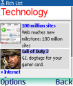 |
Rich List: Rich lists shows how content can be presented
in appealing ways also when doing LCD XHTML-MP. The template uses a simple table for layout, which, in spite of what W3C's BP recommends, is a good practice. |
 |
Grid: VodafoneLive-inspired grid menu. This kind of interface
is usually only recommended for devices with a 4-way rocker to skip from one row to the next
without forcing users to click their way through each and every link. The two-column layout may not be adequate for devices with large screens. In the case of commercial portals, the number of columns is often adjusted dynamically according to screen width. This function can be easily implemented with the help of an adaptation framework. |
   |
|
| Forms: the template above examplifies how forms should be broken down into
simpler steps (i.e.a "wizard") to let users concentrate on a series of simpler tasks. This
increases the chance that users will complete the process and reduce the number of errors. The example refers to the process of collecting credit-card information. While breaking complex forms down into simpler tasks is recommended, it is advisable to provide some indication about how far a user has come in the process whenever the wizard requires more than 2 or 3 steps to complete: Log-analysis has shown that the number of users drops dramatically when users get as far as the third step and there is no end in sight. Progress can be easily communicated by labelling each page of the wizard with "step X of Y", where Y is the total number of steps and X is the step the user is requested to perform. |
|
6 References
XHTMLTUT - XHTML Mobile Profile 1.0 TutorialsXHTML MP tutorial at Developers Home:
http://www.developershome.com/wap/xhtmlmp/
XHTML MP tutorial at Openwave:
http://developer.openwave.com/dvl/support/ documentation/guides_and_references/xhtml_tutorial/index.htm
XHTML MP Reference at Openwave:
http://developer.openwave.com/documentation/xhtml_mp_css_reference/
XHTML MP 1.0 Specification from OMA:
http://www.openmobilealliance.org/tech/affiliates/
wap/wap-277-xhtmlmp-20011029-a.pdf
The Wireless Universal Resource FiLe:
http://wurfl.sourceforge.net
Drutt:
http://www.drutt.com
MobileAware:
http://www.mobileaware.com
Volantis:
http://www.volantis.com
MWI Device Description Working Group (DDWG):
http://www.w3.org/2005/MWI/DDWG/
Wireless Abstraction Library by Luca Passani:
http://wurfl.sourceforge.net/java/tutorial.php
Implementation of WALL for PHP:
http://wall.laacz.lv/
Opera Small-Screen Rendering:
http://www.opera.com/products/mobile/smallscreen/
WML 1.1:
http://www.w3schools.com/wap/wml_reference.asp
Wireless Application Protocol:
http://www.webopedia.com/TERM/W/WAP.html
HTML - The Hypertext Markup Language:
http://en.wikipedia.org/wiki/HTML
Issues with XHTML Mime Types in Web Browsers:
http://en.wikipedia.org/wiki/XHTML#Adoption
Set of Java APIs for the development of mobile applications:
http://java.sun.com/javame/index.jsp
Flash Lite. Macromedia's Flash retrofitted for mobile phones:
http://www.adobe.com/products/flashlite/
Application development platform created by Qualcomm for mobile phones:
http://brew.qualcomm.com/brew/en/
Default Delivery Context as defined in W3C Best Practices for the Mobile Web:
http://www.w3.org/TR/mobile-bp/#ddc
W3C Best Practices for the Mobile Web:
http://www.w3.org/TR/mobile-bp/
W3C Markup Validation Service:
http://validator.w3.org/
Command-line XML parser:
http://xmlsoft.org/xmllint.html
Extract best MIME type from Accept Header:
http://www.developershome.com/wap/xhtmlmp/xhtml_mp_tutorial.asp? page=mimeTypesFileExtension
WAP CSS Tutorial:
http://www.developershome.com/wap/wcss/
CSS-based expressions to limit the scope of stylesheet:
http://www.w3.org/TR/css3-mediaqueries/
.mobi Top Level Domain:
http://pc.mtld.mobi
.mobi Switcher: direct mobile browsers to .mobi site and web browsers to web sites
http://www.passani.it/switcher/
To Differentiate Mobile Devices or User Agents Made
by Different Companies with the User-Agent Header:
http://www.developershome.com/wap/detection/detection.asp? page=userAgentHeader
The Wireless FAQ. How do I prevent a WML deck from being read from the cache:
http://www.thewirelessfaq.com/ how_do_i_prevent_a_wml_deck_from_being_read_from_the_cache
WikiPedia on URL Re-Writing:
http://en.wikipedia.org/wiki/Rewrite_engine
http://en.wikipedia.org/wiki/URL_rewriting
Techniques to track users from the Wireless FAQ:
http://www.thewirelessfaq.com/ how_do_i_remember_users
Techniques to optimize pictures from the Wireless FAQ:
http://www.thewirelessfaq.com/ how_can_i_optimize_image_size
WMLProgramming Mailing List at Yahoo Groups:
http://tech.groups.yahoo.com/group/wmlprogramming/
Issues with Mobile Web Best Practices 1.0:
http://www.passani.it/gap/intro.htm